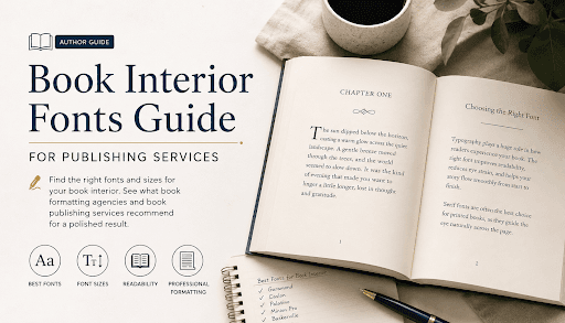
Which Fonts and Font Sizes Are Best for Your Book's Interior Formatting?
Why Typography Matters More Than You Think
The Two Categories of Fonts You Need to Know
The Classic Fonts Used in Book Publishing
If there were a "most trusted font in book publishing" award, Garamond would win it most years. Developed in the 16th century and refined many times since, Garamond is elegant, readable, and warm. It has a slightly old-world feel that works beautifully for literary fiction, historical novels, and serious nonfiction. It's also economical; its letterforms are slightly narrower than many modern fonts, which means you can fit more words per page without the text feeling cramped.
Adobe Garamond and EB Garamond are two popular digital versions, each with slightly different weights and spacing.
"When in doubt, use Caslon" — that old saying among typesetters still holds up. Caslon has extraordinary versatility. It feels authoritative without being stiff, readable without being bland. It works across genres and trim sizes. William Caslon designed it in the early 1700s, and it's been in print use ever since. That's not nostalgia; that's proof.
Here's where we need to have an honest conversation. Times New Roman is technically a fine font; it was designed specifically for newspaper readability, and it does that job extremely well. But it has become so overexposed through decades of word processing defaults that it reads as generic in a book context. Most professional self publishing services actively steer clients away from it — not because it's bad, but because it signals "default" rather than "intentional." If you want your book to look professionally designed, skip Times New Roman even though it works.
Palatino was designed by Hermann Zapf in 1949 and has a slightly more calligraphic quality than Garamond or Caslon. It has a bit more visual weight, which makes it particularly good for books that will be read in lower light conditions or by readers who prefer slightly larger-looking letterforms. It's warm, classical, and widely available.
Designed by Robert Slimbach for Adobe, Minion Pro is one of the most well-rounded book fonts available today. It's clean and contemporary while still carrying the warmth of classical serif design. It handles italics exceptionally well, which matters a lot in fiction where emphasis and internal thought are frequently italicized. Many professional book formatting agencies consider it a go-to for everything from genre fiction to academic texts.
Sabon is often called the "designer's Garamond" because it was created by Jan Tschichold in the 1960s as a more standardized, print-consistent version of the Garamond tradition. It prints beautifully, even at smaller sizes, and has a slight formality that suits literary fiction and serious nonfiction especially well.
For self-publishing authors working on a tighter budget, Gentium is a free, open-source font that genuinely holds its own against its paid counterparts. It's clean, well-spaced, and reads comfortably in long-form text. It's a legitimate choice, not just a compromise.
What About Sans-Serif in Books?
- Chapter headings and subheadings: A clean sans-serif contrasts beautifully against a serif body font
- Children's picture books and early readers: Younger readers often find sans-serif letterforms easier to identify
- Textbooks and reference books: Section labels, callout boxes, captions, and sidebars often use sans-serif fonts
- Graphic design books and art books: Where the contemporary aesthetic of the content calls for it
- Young adult fiction: Some YA books successfully use humanist sans-serif fonts with a bit of personality
Font Size: Getting It Right for Print
The generally accepted range for body text in adult trade books is 10pt to 12pt, with 11pt being the sweet spot for most standard trim sizes and serif fonts.
- 10pt to 10.5pt: Used when you're working with a font that runs slightly large, or when the trim size and page count make it necessary to keep pages down. Fonts like Minion Pro or Garamond can be comfortable at this size. Anything smaller risks excluding readers with any degree of visual sensitivity.
- 11pt: The workhorse size for adult fiction and nonfiction. In most serif fonts, at most standard trim sizes, 11pt body text hits the ideal balance between readability and efficient use of space.
- 11.5pt to 12pt: Used for books targeting older readers, for genres where a slightly more open, spacious feel is appropriate, or for fonts that run naturally small. Some memoir and personal essay collections use 12pt to give the text a bit more presence on the page.
- 12pt and above: More common in large-print editions, children's books, or specific accessibility-focused publications.
Line Spacing: The Unsung Hero
Chapter Headings: A Different Set of Rules
- Larger version of the body font: Clean, unified, classic. Simply increasing the body serif to 18pt–24pt and adding extra space above and below does the job elegantly.
- A complementary display font: Some books use a more decorative or distinctive font for chapter titles. This can add real character. Just make sure it's legible at the size it'll be used.
- All-caps with letter-spacing: Taking any clean serif or sans-serif, setting it in caps, and adding a bit of extra tracking (space between letters) creates a crisp, formal look that suits a wide range of genres.
- A contrasting sans-serif: Pairing your serif body text with a clean sans-serif chapter heading is one of the most reliably attractive combinations in book design.
Trim Size Changes Everything
eBook Formatting: A Different Beast
Common Mistakes Authors Make With Typography
- Using Microsoft Word's default fonts — Calibri, Cambria, and Times New Roman are functional in a word processor. They're not interior book fonts. Using them without deliberate intent is the fastest way to make a book look self-published in the dismissive sense of the word.
- Mixing too many fonts: Two fonts, used consistently, are usually enough. Body text and headings. More than that creates visual noise.
- Ignoring widows and orphans: These are single lines stranded at the top or bottom of a page, separated from the paragraph they belong to. A professional book formatting agency catches and fixes these. DIY formatters often miss them.
- Inconsistent chapter heading formatting: Chapter 3's heading shouldn't look different from Chapter 7's. Seems obvious; happens constantly.
- Forgetting about the running header font: The small text at the top of each page (usually the author's name on the left, the book title on the right) needs to be sized and styled deliberately. It should be smaller than the body text, typically 8pt to 9pt, and often set in small caps for elegance.
- Ignoring the first paragraph indent rule: Traditional typography convention says the first paragraph after a chapter heading or section break has no indent. Every subsequent paragraph does. It's a small detail that separates polished typesetting from amateur work.
When to Call in the Professionals
A Quick Reference Cheat Sheet
- Body text fonts to consider: Garamond, Caslon, Palatino, Minion Pro, Sabon, Gentium
- Body text size: 10pt–12pt (11pt is the standard sweet spot)
- Line spacing: 120%–145% of point size (14pt leading for 11pt type is common)
- Chapter heading size: 18pt–24pt, depending on font and style
- Running header size: 8pt–9pt, often in small caps
- Trim size matters: Always calibrate font size to your trim
- Print vs. eBook: Two different files, two different strategies
- Fonts to avoid as body text: Times New Roman (overexposed), Calibri (too digital), any display or decorative font
Final Thoughts
FAQs
1. What is the best font for book interior formatting?
Serif fonts like Garamond, Caslon, and Minion Pro are top choices used by professional book formatting companies. They improve readability and reduce eye fatigue over long reading sessions.
2. What font size should I use for my book's interior?
The industry sweet spot is 11pt, with an acceptable range of 10pt–12pt. Always finalize size alongside your trim size and line spacing for best results.
3. Can I format my book myself, or do I need a professional book formatting company?
DIY tools like Vellum and InDesign work for simple manuscripts. But professional book formatting agencies handle technical details like kerning, hyphenation, and print-ready files far more reliably.
4. What standards do professional book publishing companies follow?
Most book publishing agencies use serif fonts at 10pt–12pt, leading at 120%–145%, and chapter headings between 18pt–24pt. Consistency and print-readiness are the top priorities.
5. How long does book formatting take, and what does it cost?
Most book formatting specialists complete a standard novel in 3 to 7 business days, with costs ranging from $150 to $600+, depending on complexity and scope.
Author Bio:
Isabella Watson is a professional content specialist focused on book publishing and author services. She writes and reviews technical and informative content to help aspiring and seasoned authors navigate the professional publishing process. Her work focuses on quality, trust, and hassle-free creative writing.
GET FREE CONSULTATION
Recent Posts
Why Thousands of Authors Trust Berg Publisher for Professional Publishing Services?
Our Publishing Services Explained | Expert Book Publishing Services
Client Satisfaction Comes First at Berg Publisher Book Publishing Agency
Is hiring a ghostwriter from a ghostwriting agency worth it?
Why professional authors choose ghostwriting services?
Can I Hire a Ghostwriter Online to Write My Life Story?
What are eBook writing services, and how do they help businesses generate leads?
What Berg Publisher Does as a Leading Professional Book Publishing Agency?
A Guide to Understand Rights and Credits Retention in Ghostwriting Services.
Why Book Editing is More Important Than You Think?
How to Choose the Right eBook Writing Service for Your Book or Business?
Common Mistakes Authors Make Without an eBook Writing Service
How Much Do eBook Writing Services Cost?
Professional eBook Writing, Ghostwriting and Editing Services for Authors
Best Book Publishing Agencies for Aspiring Authors 2026
Manuscript getting rejected again and again?: 2026 best book editing service
Explore the top book marketing services: Self-book publishing authors 2026
10 major benefits of hiring fiction ghostwriting services for your novel
How to design a professional book cover that sells in 2026
How to Hire a Fiction Ghostwriter for Your Novel
How to Choose a Book Publishing Agency for International Distribution?
How Book Publishing Agencies Choose Which Manuscripts to Publish?
The Day-to-Day Workflow of a Professional Book Publishing Agency?
How Editors at a Book Publishing Agency Shape Your Manuscript into a Bestseller?
AI vs human ghostwriters: Which is best for writing books in 2026?| ghostwriting services
What Most Authors Don't Know About Book Publishing Agency Submission Processes?
AI Ghostwriting in 2026: How Human Ghostwriters Still Add Value
Ghostwriting Services | Best AI Tools for Writing Books in 2026
Behind the Scenes: How Agencies Decide Marketing Budgets for Books?
How a Book Publishing Agency Evaluates Manuscript Potential (2026 Guide)
Do AI tools beat human writers?| Book publishing services explained
Book Publishing Service Explain, Will AI Replace Authors?
10 Reasons to Hire a Professional eBook Writer in 2026
30+ Questions to Ask an Author About Their Book (With Answer Guides)
How to Write a Book Without Typing
How Book Publishing Services Help Veterans Share Their War Stories?
How Agencies Handle Multiple Authors Efficiently?
How Book Publishing Agency Experts Predict Reader Trends?
Why Book Editing Services and Editors Matter in the AI-Driven Publishing Era?
Pricing Secrets: How a Book Publishing Agency Decides Author Royalties?
How does a Book Marketing Agency Handle Sci-Fi, Fantasy, and Romance Books Differently?
How to Negotiate the Best Deal with a Book Publishing Agency (2026 Guide)
I Published My First Book at 60: Guide to Book Publishing Services for First-Time Authors
The Real Cost of Publishing a Book via Book Publishing Services in 2026?
30+ Questions Every Author Should Ask Before Using Book Publishing Services
Hire an EBook Writer to Build Brand Authority
Why Book Launches Get Delayed (and How to Avoid It)
Is Your Book Ready to Be Published? Check Now
Manuscript to Published Book: A Step-by-Step Guide
Famous CEO Books That Were Written by Ghostwriters
Common Publishing Mistakes Every Author Should Avoid
Legal Requirements for Publishing a Book in the USA
What Successful Self-Published Authors Do Differently
Will Your Book Ever Pay You Back? Here's the Truth
Choosing the Right Genre and Category for Your Book
Hidden Contract Clauses Authors Miss in Book Deals
Best Fiction Writing Services | Berg Publishers
Who Owns a Ghostwritten Book? | Berg Publishers
Book Publishing Services That Don't Hide the Price
Ghostwriter vs. Co-Author: Which One Is Right? | Berg
How CEOs Become Published Authors | Berg Publishers
Amazon Publishing vs. Berg Publishers: Which Wins?
How to Vet a Ghostwriter: A 10-Point Checklist
Vanity Press Warning: 12 Red Flags Before You Sign
eBook Writing Service: How to Choose the Right One
Why Ebooks Fail: 8 Honest Reasons You Can't Ignore
5 Reasons to Hire an Editor Before Self-Publishing a Book
How to Tell If Your Book Is Competing Against an AI Knockoff on Amazon
How to Promote an Ebook After Publishing: Beyond Amazon and Your Website
How to Sell Short Stories on Amazon Kindle: Tips and Tricks for New Authors
8 Podcast Recommendations for Writers and Self-Publishers (2026 Edition)
An Interview with USA Today Bestselling Author Kelly
How Do I Publish a Book for Free on Amazon Kindle Direct Publishing (KDP)? The Complete Step-by-Step Process
AI and Book Publishing in 2026: 4 Changes Every Author Should Know
Which Fonts and Font Sizes Are Best for Your Book's Interior Formatting?
Business Ebook vs Amazon Ebook: Two Completely Different Goals
Cost vs Value: Is a Professional Agency Worth It for Your Book?
15 Creative Book Marketing Ideas for Self-Published Authors (2026 Guide)
2026 Publishing Trends: What Authors, Editors & Publishers Must Know
Internal vs External Conflict: How They Are Used in a Story
Book Royalty Calculator: KDP vs IngramSpark vs Draft2Digital (Exact Math)
Best Publishing Platforms 2026 to 2027: The Ultimate Comparison Guide
AI Book Cover Design: Legal Risks Every US Author Must Know in 2026
How to Hire and Work with a New York Ghostwriting Company
How Much Do Ghostwriters Cost in New York? A Complete NYC Pricing Guide for 2026
The Ultimate Guide on How to Write a Book in 2026
Tips for Authors Writing in Less Popular or Emerging Genres
Top 10 Best Selling Authors of All Time | Book Publishing
We create books that connect with audiences. From the initial outline to publication and marketing, we support our clients throughout the entire process.
SERVICES
- Fiction Ghostwriting
- Non-Fiction Ghostwriting
- Book Editing
- Book Printing
- Book Marketing
- Audiobook Publishing
- Hybrid Publishing
- IngramSpark Publishing
- ISBN and Copyright Registration
- Book Cover Design
- eBook Writing
- Self-Publishing for Tech Founders
- Amazon Publishing
- Self-Publishing vs Traditional Publishing
- Book Publishing Timeline & Process
- Book Publishing Cost USA
- Author Success Stories & Case Studies
- Biography Writing
- Novel Writing